If you thought XML sitemaps were all you needed, think bigger. This guide goes beyond the basics—covering XML, HTML, and visual sitemaps in one unified, modern roadmap. Expect deeper technical insights, stronger SEO guidance, UI planning support, and hands-on tools to build a better-structured website in 2025.
1. XML Sitemaps: Advanced Technical SEO Deep Dive
What They Are & Why They Still Matter
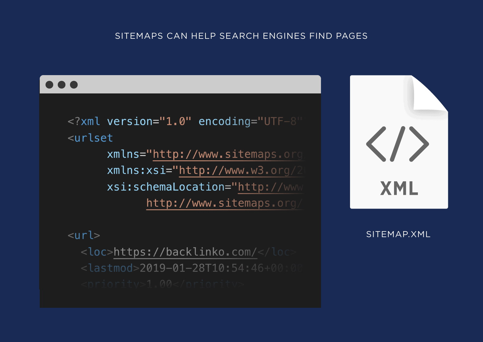
An XML sitemap serves as a machine-readable blueprint of your website so search engines can discover, crawl, and index your key content efficiently—especially crucial for large sites (500 + URLs), media-rich content, or pages buried in complex structure
Hreflang support via tags enables multilingual indexing.
Exclude noindex or canonical-conflicted pages; align the sitemap with robots.txt rules (TEAM LEWIS).
🧰 Example XML & Index Snippet
Automating XML Creation
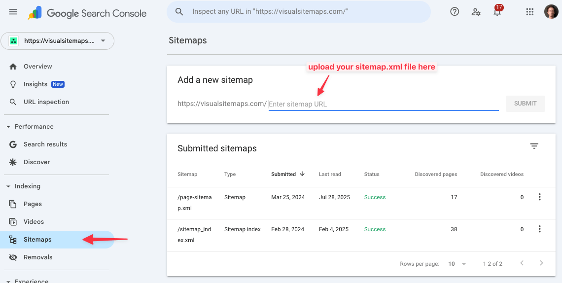
With VisualSitemaps, you can visually audit, edit, and optimize your site’s page structure and scope, and in 1-click export as a valid sitemap.xml ready for Search Engines.
Or If you use sites like WordPress, plugins like Yoast or RankMath SEO generate and auto-update dynamic sitemaps. New pages are appended instantly:
2. HTML & Public Sitemaps: Bridging SEO and UX
What They Are & Why Use Them
An HTML sitemap is a human-visible page listing core URLs in an organized hierarchy. It supports users and search engines alike by improving crawlability and internal linking—especially useful for new sites or deeper content catalogs.
✅ Optimization Tips
Include only indexable pages (mirror robots.txt).
Keep to ≲ 100 links or break into sub-sitemaps.
Use keyword-rich anchor text to strengthen PageRank flow.
Auto-generate with plugins like Yoast or Rank Math for dynamic updates.
3. Visual Sitemap: Design & Planning Tool
The Purpose & SEO Impact
A visual sitemap is a diagrammatic map of your site structure—used by design and content teams to plan navigation, reduce complexity, and enforce best-in-class internal linking [6][7][8]. The clearer IA indirectly boosts SEO via improved topical clustering and link equity.
How It Works
Color-code nodes for page types (product, support, blog).
Annotate live vs future pages, auth states, or wireframe previews.
Does a sitemap guarantee indexation?
No—sitemaps guide crawlers but don’t guarantee indexing; internal linking and quality matter more ( Webmasters Stack Exchange, Google for Developers, .
What about broken URL tags or syntax errors?
Validate via XML checkers or Search Console reports.
sitemap-page-indexing-redirects
8. AI-Ready IA with VisualSitemaps + VisualFlows
Modern AI-powered discovery engines thrive on semantically coherent site architecture. VisualSitemaps and VisualFlows give you drag-and-drop control to flatten hierarchies, tag pillar/cluster pages, and map user journeys—all signals that Large Language Models can parse for better context. External reviewers confirm the value: a 9.6/10 rating on B2Saas for VisualSitemaps’ ability to auto-generate high-resolution IA maps. (B2Saas)
VisualSitemaps exports both XML and annotated visual maps, reducing click-depth and exposing orphan pages. (VisualSitemaps)
VisualFlows extends this with journey-mapping, funnel diagrams, and behavioral annotations—critical for AI-driven site assistants to understand intent flow.
Your SEO edge in 2025 isn’t about having a sitemap—it’s about a layered strategy: visual planning, user-first HTML, and crawler-optimized XML working in harmony. Add AI-ready IA via VisualSitemaps + VisualFlows, and you’ll future-proof indexation, UX, and semantic discoverability alike.
You know that moment when you’re trying to explain your website’s architecture to someone… and you reach for a napkin to sketch it? That’s not just a sign of creative genius. It’s a sign your tools are failing you.
For Wix users, site structure and SEO planning often feel invisible and intangible. There’s no birds-eye view, no easy way to plan internal links, and no obvious way to flag orphaned pages or category sprawl.
But you can’t optimize what you can’t see.
That’s why VisualSitemaps and VisualFlows are becoming the secret weapons for Wix users who want to treat SEO and IA as strategic assets—not afterthoughts.
Let’s break this down.
Why Wix SEO Feels Like a Black Box
Wix has made major improvements in SEO over the past few years. You can edit meta titles, set custom URLs, even manage some structured data. But that doesn’t mean it’s painless.
😡 Limited control over page hierarchy
😡 No native visual sitemap
😡 Difficult to track internal page depth
😡 No contextual understanding of what’s connected to what
In short: you’re flying blind.
If your goal is to build an SEO-resilient site with proper structure, you need to stop thinking in checkboxes and start thinking in maps.
Generate a True Visual Sitemap Instantly
VisualSitemaps gives you exactly that: a complete, interactive visual crawl of your Wix site.
Once scanned, your entire site architecture appears as a navigable, screenshot-rich map. You can:
✅ Export everything for documentation or SEO audits
No more bouncing between tabs or using browser extensions to cobble together site audits. The sitemap is both a diagnostic tool and a planning surface.
Optimize Internal Linking with VisualFlows
SEO isn’t just about what’s on the page—it’s about what connects your pages.
VisualFlows is where you architect those connections.
Drag your current sitemap into a workspace. Then:
✅ Draw out internal linking paths based on topic clusters
✅ Annotate anchor text goals or call-to-action placements
✅ Share with your team or client as a blueprint for implementation
This turns internal linking from an afterthought into a visual plan.
Page Clustering for Optimal SEO
Interlinking with VisualFlows
It’s especially powerful when combined with SEO strategy. Want to boost a high-converting service page? Create a linking strategy to funnel traffic from supporting blog content—visually.
Planning Keyword Clusters Like a Pro
Visual mapping isn’t just for structure—it’s for intent segmentation.
Using VisualSitemaps and VisualFlows, you can organize pages by:
✅ Informational content: blog posts, how-tos
✅ Transactional pages: product or service pages
✅ Navigational content: about pages, contact forms
This allows you to create keyword-aligned site clusters, boosting topical authority.
Need to see where you have thin content? Or which pages are over-linked? Just glance at the flowboard.
A boutique interior design studio had a Wix site with 67 pages. No formal linking strategy. No clear content groups. Bounce rates were high, and new pages rarely ranked.
After one crawl with VisualSitemaps, they discovered:
❌ 14 orphan pages (no inbound links)
❌ Blog posts with zero internal links
❌ Category pages linked from only one place
Using VisualFlows, they built:
✅ A three-tier content hierarchy
✅ Cluster-based linking from blogs to portfolio pages
✅ Contextual CTAs in every primary section
Three months later? Sessions up 38%. Pages per session: up 47%.
They didn’t “add more content.” They made their structure make sense—to users and to Google.
Why This Matters More in 2025
SEO isn’t getting easier. Google’s moving toward entity understanding and semantic relationships. That means your site isn’t just being ranked—it’s being modeled.
The better your structure, the better your chances of:
Ranking in Ai Discovery Results and snippets
Appearing in knowledge panels
Earning higher trust via interlink clarity
And with Wix’s inherent structural limitations, visual-first tools fill a major gap.
Final Word: Stop Guessing. Start Mapping.
If your SEO strategy relies on written to-do lists and plugin checkboxes, you’re missing the bigger picture—literally.
With VisualSitemaps and VisualFlows, you:
✅ Make structure visible
✅ Plan internal linking logically
✅ Align content with search intent
✅ Export Full SEO documentation as CSV
This is how pros audit. This is how pros scale.
So here’s your next move:
Run a free crawl. Look at your map.
Ask: Does this make sense to a human?
If the answer is no—it definitely doesn’t make sense to Google.
You ever open your Wix site on a phone and instantly regret your life choices?
It looked fine on desktop. It looked fine in the editor. But now you’re seeing buttons that overlap text, a call-to-action floating in white space, and a footer that’s become a ghost of its former self.
Welcome to the chaos of design inconsistency at scale.
This post isn’t about blaming Wix—it’s about getting ahead of what happens after you’ve built a few dozen pages. Whether you’re a solo founder, agency, or designer, there’s a smarter way to manage design debt, catch errors, and keep UX tight across devices.
The secret? Visual QA and collaboration toolsfrom VisualSitemaps and VisualFlows.
Let’s show you how to design like you actually have a QA team—even if you don’t.
Why Design Inconsistency Happens on Wix (Even If You’re Careful)
Wix makes it easy to build. That’s the magic. But over time:
✅ You forget which font was used where
✅ A new section breaks spacing rules
✅ Someone adds a third-party widget with styling conflicts
✅ Mobile layout doesn’t match desktop intent
The result is that your site goes from polished to patchy—especially when more people start editing it.
And when design inconsistency creeps in, UX suffers:
❌ Users don’t trust visuals that feel broken
❌ Conversion paths become confusing
❌ Brand identity takes a hit
You need visibility. Enter: Visual QA with VisualSitemaps.
Automated Screenshot Crawls to the Rescue
Imagine clicking a button and getting high-resolution screenshots of every page on your Wix site—on desktop and mobile.
Now imagine doing that every week. Automatically.
VisualSitemaps’ Scheduled Crawlslet you:
🕓 Set recurring screenshot scans (daily, weekly, monthly)
🖥 View pixel-perfect renderings of every page
🔍 Compare mobile vs. desktop layouts side-by-side
🐞 Catch visual bugs before your users do
No more guessing when a visual bug appeared. No more hoping your freelancer double-checked mobile view.
This is like having a QA assistant who never sleeps. And because screenshots are archived, you get version history to track changes over time.
Spot the Changes with Visual Diffing
Scheduled screenshots are great. But VisualSitemaps takes it further with change detection.
Every time a crawl runs, the system:
✨ Highlights visual differences page by page
🧱 Flags layout shifts, spacing changes, and style deviations
📝 Lets you annotate directly on the screenshot
VisualSitemaps AI uncovers content changes from release to release
No code. No DevTools. Just instant visibility into what changed, where, and why it matters.
This is game-changing for anyone managing multiple pages or multiple editors. It turns chaos into calm.
Wix is amazing… until it isn’t. Let’s be honest. Wix is like the IKEA of website builders—super approachable, looks good in the showroom, but you’ve definitely cursed once or twice while trying to put it all together. And just like IKEA furniture, your Wix site might look great at first—but open a drawer, and suddenly your internal linking strategy falls out like mismatched socks.
In 2025, a lot of smart folks—small business owners, designers, even developers—are hitting frustrating walls with Wix. And this post? It’s your blueprint. We’re not just diagnosing the five biggest headaches; we’re showing how visual-first tools like VisualSitemaps and VisualFlows are changing the game.
Let’s unpack this.
SEO and Site Structure Still Feel Like a Black Box
You did everything right: added your meta tags, wrote catchy headers, even paid for that premium plan. And yet—Google still treats your site like it forgot to brush its teeth.
The truth is: Wix’s out-of-the-box SEO capabilities are limited by design. You don’t have full control over your URL structure. Canonicals get weird. And internal linking? It’s basically an abstract painting.
But here’s where VisualSitemaps steps in. It automatically crawls your Wix site and produces a visual sitemap—a map you can actually see, click, and annotate.
Generated visual sitemap with colored tags for internal linking opportunities
Need to group pages by topic? You can tag them. Want to export to Google Drive for your SEO consultant? Done. And if you’re managing a large site, VisualFlows lets you map out future internal link plans in a drag-and-drop workspace.
You don’t fix SEO with checkboxes—you fix it with structure. VisualSitemaps makes structure visual.
Design Inconsistency and UX Fragmentation
We love Wix’s drag-and-drop freedom… until it becomes a free-for-all.
Suddenly, your homepage hero text is Helvetica 30pt while the Services page is shouting in Arial 42pt. Someone added a new section and forgot mobile optimization. The header changes color on three different pages and nobody knows why.
Visual QA from VisualSitemaps lets you schedule high-res screenshot crawls of your live site—on desktop and mobile. You can detect changes, annotate bugs, and collaborate with designers all within one clean dashboard.
Automated Visual QA
Imagine knowing every change that hits your site, without needing to click through every page manually.
Pair that with VisualFlows, and your UX team can mock up improved layouts, plan navigation structures, and annotate improvements before pushing live.
No more “surprise” spacing issues on launch day. Just confident, consistent design across every device.
Performance Bottlenecks and the Wix Speed Ceiling
Wix loads a lot of JavaScript. Combine that with large images, animations, and video backgrounds, and your site goes from “pretty” to “pretty slow.”
The platform offers some native performance options, but real optimization starts with visibility. VisualSitemaps lets you perform scheduled crawls and cross-reference performance issues over time.
( coming soon! ) Hook in Google Analytics, and suddenly you’re not just seeing page structure—you’re seeing exit rates, bounce behavior, and speed performance trends… visually.
Google Analytics Integration to see Traffic Flows
Even better, every crawl is archived. So when someone asks “when did this page slow down?” you can show them exactly what changed.
VisualSitemaps doesn’t replace Lighthouse—it complements it with the kind of “at-a-glance” clarity that audits miss.
Scalability and Platform Lock-In
You built a lean, 10-page site. It’s now 45 pages. You’ve added forms, a blog, product collections, maybe a membership area. Suddenly, you realize:
There’s no good way to model what comes next.
Wix’s feature set is starting to feel… boxed in.
Migrating to Webflow, WordPress, or Shopify feels like starting from scratch.
VisualFlows is built for exactly this. You can drag in your current sitemap, overlay new planned sections, and simulate migrations before writing a single line of code.
Visualizing Procedures, Tasks, Timelines, and Resources
VisualFlows transforms the way you stay organized. Picture managing a project with multiple team members, deadlines, and tasks—VisualFlows helps you map it all out from start to finish with ease. Its intuitive drag-and-drop interface lets you build a detailed project plan and break it down into manageable stages without the complexity.
For instance, if you’re leading a product launch, you can start with a high-level flowchart outlining key phases like product development, marketing, and post-launch support. Each phase can then be divided into actionable tasks—such as “design product packaging,” “create marketing materials,” or “set up customer support.” By visualizing these tasks and their dependencies, you can track progress more effectively and make sure nothing slips through the cracks.
Collaboration is just as seamless. With integration into tools like Microsoft Teams, Webex, and Zoom, your team can contribute to the same project in real time, no matter where they’re located.
It’s like dry-running a redesign or migration with zero risk. And because everything’s visual, your team—or your client—gets it instantly.
No more confusing spreadsheets or “trust me” pitches.
How to Build Visual-First Confidence into Your Website Strategy
Whether you’re staying on Wix, preparing to migrate, or just trying to keep your SEO from crumbling beneath your carousel sliders—seeing is optimizing.
VisualSitemaps and VisualFlows give you the power of visibility. They’re not just tools; they’re your digital architecture goggles.
So if your website feels like a house built on sand, let’s get you a solid blueprint.
Run a free crawl on your Wix site.
Visualize your sitemap.
Tag, group, annotate.
Share it with your team.
Make smarter decisions—before you waste time chasing symptoms.
Wix doesn’t have to be the end of your website journey. With the right visual tools, it’s just the beginning.
Planning for Growth: Performance & Scalability Issues on Wix
There’s a moment in every site’s life when you realize: This thing is bigger than I thought.
It started with 5 pages. Then you added a blog. Then services. Then case studies. And now you’re at 40+ pages, half of which you can’t find in the editor without a search bar.
This is what we call the “Wix outgrowth moment.” And if you’re here, you’re not alone.
Wix is great for getting started. But once your business or brand scales, you may run into limitations around speed, structure, and flexibility. The good news? You can visualize and manage your site’s growth—without ripping everything out.
Let’s look at how VisualSitemaps and VisualFlows help growing Wix sites spot performance issues, manage scale, and even prep for migration.
Why Wix Sites Slow Down as They Grow
At smaller scales, Wix performance is solid. But as you add more:
Images
Videos
App integrations
Custom interactions
…your site starts dragging its feet.
Common speed pain points:
⚠️ Code bloat from unused templates
⚠️ Too many high-res images or videos
⚠️ Poor caching or lazy loading control
⚠️ Third-party widgets slowing render times
And Wix’s built-in tools don’t always show you where the problem is coming from.
Visual Performance Tracking with Scheduled Crawls
Here’s where VisualSitemaps changes the game.
With automated screenshot crawls, you can:
✅ Capture how every page renders on desktop and mobile
✅ Detect visual shifts or slow-loading assets
✅ Archive and compare performance over time
Even better, you can layer in Google Analytics integration to get real behavioral data ( coming soon!) :
Which pages have the highest exit rates?
Where do users bounce?
Which sections get skipped or stalled?
Wix Visualize Traffic Flows on your Crawled Maps ( coming soon! )
Suddenly, you’re not guessing why the site is slow or underperforming. You’re seeing it, backed by crawl evidence and user data.
Mapping Scalability Visually
Beyond speed, scale brings structure problems:
It’s hard to see what pages exist
Category groups become inconsistent
You duplicate content unintentionally
UX suffers from disjointed navigation
With VisualFlows, you can pull your full sitemap into a planning board and:
✅ Group existing pages by theme
✅ Plan new sections without affecting live content
✅ Annotate with UX or dev notes
✅ Share a full visual blueprint with stakeholders
This is what smart growth looks like—planned, not patched.
Topical Clustering Planning
Spotting the Signs It’s Time to Migrate (or Not)
Not every growing site needs to leave Wix. But some do.
Signs your site is outgrowing the platform:
You need advanced dynamic content structures
You’re limited by storage or database caps
You require custom integrations that Wix doesn’t support
You want full control over performance optimization
Instead of guessing, you can simulate the transition visually using VisualFlows.
Create:
A proposed structure for your next platform (WordPress, Webflow, Shopify, etc.)
An exportable map of your current content architecture
A visual migration path with notes, priorities, and blockers
Case Study: From Cluttered Growth to Clean Planning
A growing DTC skincare brand built its site on Wix. Over 60 pages. Dozens of products. A blog. Landing pages for every campaign.
What started strong began to buckle:
Slow mobile performance
Duplicated product pages
Blog posts buried five clicks deep
With VisualSitemaps, they:
✅ Identified underperforming pages using GA overlays
If you’ve been in the SEO world for more than 15 minutes, you’ve heard of Screaming Frog. It’s a desktop-based crawler used by technical SEOs to dig deep into site architecture. Need to find broken links, missing title tags, duplicate content, or crawl-depth issues? Screaming Frog is your go-to weapon.
This software mimics how search engine bots crawl a website, delivering a massive dataset of what’s under the hood—status codes, meta data, canonicals, internal linking structure, hreflang issues, and more. It works fast, runs locally, and is practically a rite of passage for SEO audits.
But here’s the thing: while it’s incredibly powerful for data-rich diagnostics, it wasn’t built to be pretty. Or collaborative. Or visual. And in today’s multi-disciplinary teams of SEOs, UX designers, content strategists, and clients? That matters.
Where Screaming Frog Falls Short for Today’s Teams in 2025.
Don’t get us wrong—Screaming Frog is the OG of tools, and it’s f’n brilliant. But there’s a missing piece that becomes more apparent the larger or more visually complex your site becomes.
Let’s talk about what Screaming Frog doesn’t do:
❌ It doesn’t generate visual sitemaps or page thumbnails
❌ It doesn’t help you explain crawl issues to non-technical stakeholders
❌ It doesn’t allow for visual audits, screen capture workflows, or UX prioritization
❌ It doesn’t support real-time cloud collaboration or seamless sharing
If you’ve ever tried to show a Screaming Frog crawl to a designer or CMO, you know the pain. It’s like handing them a spreadsheet and expecting applause.
This is where VisualSitemaps enters the scene—not as a replacement, but as a missing layer of clarity and communication.
What Is VisualSitemaps? A Visual Audit Companion
VisualSitemaps is a cloud-based platform that automatically crawls and renders websites as visual sitemaps. It captures high-resolution screenshots of each page, preserves the navigation hierarchy, and presents the entire structure in a way that’s both interactive and intuitive.
Unlike Screaming Frog, which emphasizes crawl depth and data diagnostics, VisualSitemaps focuses on visual clarity, user experience, and stakeholder communication.
Let’s say you’ve got a site with thousands of pages. Screaming Frog will tell you where the redirects and 404s are. VisualSitemaps will show you what those pages look like—how the hero images are rendered, whether modals block key content, if a site has visual design inconsistencies, and so much more.
More importantly, it lets you share this visual architecture with your team or client, export to PDF or HTML, leave comments, and annotate what needs attention—all from the cloud.
Screaming Frog + VisualSitemaps = SEO Workflow Synergy
Here’s the unlock: you don’t have to choose.
In fact, the smartest SEO teams are using both Screaming Frog and VisualSitemaps together, like a well-synced audit engine.
Typical workflow:
Run a full site crawl in Screaming Frog
Export your crawl results or focus on a subset of URLs
Import or auto-crawl the same domain in VisualSitemaps
Instantly visualize the structure, prioritize UX issues, and annotate where crawl insights intersect with actual design problems
This isn’t about alternatives—it’s about stacking your tools for maximum clarity, speed, and delivery power.
Technical SEO audit? Screaming Frog. Client-facing sitemap walkthrough? VisualSitemaps. Want to show and tell instead of just report? Use both.
When to Use One vs When to Use Both
Use Screaming Frog when:
You need crawl stats, metadata, and deep technical diagnostics
Your audience is SEO-savvy
You’re building scripts, audits, or log files to catch crawl anomalies
Use VisualSitemaps when:
You’re preparing a UX review or IA presentation
Your audience includes clients, execs, or designers
You need to visualize mobile vs desktop experiences or JS-rendered elements
Use Both when:
You’re conducting a full-scale SEO audit
You need to communicate clearly across teams
You want to move from “data report” to visual storytelling
This dual-tool strategy makes your audits more complete, comprehensible, and collaborative.
This table isn’t about who wins. It’s about who brings what strength to the table. It’s about complement—not competition.
Try It Yourself: Merging the Tools in Your Audit Stack
Ready to try this synergy in action?
Here’s a real-world flow you can replicate today:
Open Screaming Frog, crawl a site you’re auditing.
Export a subset of URLs or use the entire domain.
Open VisualSitemaps, enter the same URL and initiate a visual crawl.
Within minutes, you’ll have an interactive, navigable, fully rendered sitemap.
Use VisualSitemaps’ commenting, sharing, and exporting tools to deliver your findings visually.
From there, tag UX issues that correlate with crawl issues. Annotate page-level issues that Screaming Frog discovered but are easier to explain visually. Build stakeholder decks in half the time.
Final Take: It’s Time to Think Stack, Not Swap
If you came to this post looking for a “Screaming Frog alternative,” you may have just found something better: a partner for Screaming Frog.
VisualSitemaps doesn’t replace your crawl diagnostics—it visualizes and amplifies them. It’s a tool designed for modern SEO in 2025, one who knows that data needs context, and audits need clarity.
Next time you’re planning an audit, think beyond the spreadsheet. Think beyond the crawl report.
Think stackable SEO tools that give you both the depth and the vision.
Curious to see it in action? Run your next crawl in Screaming Frog. Then fire up VisualSitemaps and visualize what you’ve discovered.
Why QA Fails (And How to Not Star in That Horror Story)
Have you ever had a launch day go perfectly? Yeah, me neither. But pre-launch QA is where you stack the deck in your favor. Most Framer projects go sideways because of simple stuff: broken links, orphaned pages, or a flow that looks fine in your head but confuses everyone else.
QA isn’t about being paranoid—it’s about being the person who catches the little things before your boss, client, or Google does.
The Bulletproof QA Checklist for Framer Sites
Want to avoid a surprise 404 on launch day? Steal this checklist and thank yourself later:
✅ Crawl your site—Use VisualSitemaps or screamingFrog to make sure every page is reachable. Any dead links will be in the report.
✅ Test all navigation—Main nav, footer, hamburger menu, “forgot password,” everything.
✅ Check for orphans—Pages that don’t link anywhere or can’t be found from the homepage are quietly plotting your downfall.
✅ Test on all devices—Phone, tablet, desktop, toaster (okay, maybe not toaster).
✅ Forms, buttons, CTAs: Click every one. Twice.
✅ SEO basics: Titles, meta descriptions, alt text—don’t skip these, even if you think “no one reads them.”
✅ Performance: If your site loads slower than a dial-up modem, fix it before launch.
Automating QA—Framer Tools & Plugins That Save the Day
Why QA by hand when robots can panic for you? Framer has plugins and integrations that crawl your project, highlight broken links, and even test for accessibility problems.
VisualSitemaps: Instantly see your full site structure—great for catching orphaned or duplicate pages.
QA plugins: Search the Framer library; new ones pop up all the time.
Automation scripts: For power users, custom scripts can flag slow pages or accessibility fails before you ever hit “Publish.”
Using Sitemaps and IA for Systematic QA
Here’s the secret: QA isn’t just about “did I spell everything right?” It’s about making sure the structure of your project makes sense.
Cross-check your visual sitemap and IA diagram against the actual build.
Follow every user flow yourself—don’t trust your memory (trust me).
Compare the final structure to the checklist you made back at the start (you did make a checklist, right?).
What To Do When You Find a Problem
Breathe In.. and out. 4x. Don’t panic. Mark the issue, fix it, re-run your test, and update your team/client. And if you find something major just before launch, remember: It’s way better to delay by a day than spend a week explaining why the signup page sends users to your old “Thanksgiving Sale” landing page.
Why Client Feedback Breaks Projects (and How to Fix It)
If you’ve ever watched a client open your beautifully built Framer site and then ask, “Wait, where’s the contact form?”—you know the pain. Feedback is inevitable, but chaos is optional. A strong IA and visual sitemap mean you can turn the review loop from “feedback whack-a-mole” into a predictable, mostly sane process.
Making IA and Sitemaps Your Secret Weapons
Before
After
The trick to smooth feedback? Show, don’t tell. Don’t send a 15-paragraph email; send a visual sitemap with annotatedscreenshots. Suddenly, even non-technical clients become feedback pros:
Clients spot missing pages way faster in a diagram than in a Google Doc.
You get actionable requests (“Can we change this section’s order?”) instead of existential questions (“What is this page for, anyway?”).
Feedback is focused. Clients can comment directly on the map or prototype—no more vague emails about “the thing at the top.”
Best Practices for Capturing, Managing, and Tracking Feedback
Centralize feedback: Use one tool for comments—Framer’s built-in comment features, Figma, Miro, whatever keeps it in one place.
Version everything: Keep a running history of changes, both for the project and for your own sanity (“No, we didn’t remove your favorite page—it was never there!”).
Label requests clearly: “Change,” “Question,” or “Blocker”—makes triage (and setting boundaries) way easier.
Summarize and clarify: After each feedback round, send a short summary: what you’ll change, what’s postponed, and what you politely declined (with a smiley emoji, if you dare).
Always update the sitemap/IA: Every round of edits should be reflected in your diagrams, so you don’t lose track.
How Visual Feedback Makes Everyone Happier
When you use visual IA and sitemaps:
Clients understand changes before you start making them (“Ah, that’s why the new menu looks different!”).
Developers avoid rework (“We changed that flow three days ago, it’s already updated in the prototype!”).
You save time—and, let’s be honest, some existential dread.
Pro Tips for Smoother Review Loops
Set deadlines for each feedback round. The only thing worse than endless edits is a surprise edit the night before launch.
Politely push back on scope creep. A clear IA is your proof: “This wasn’t in the plan, but let’s discuss for phase two.”
Document every decision. Not glamorous, but it saves arguments later.
Why bother visualizing your site's Information Architecture?
If you’ve ever tried to explain your project’s structure using just words, you already know why visual IA matters. Diagrams save relationships, projects, and possibly friendships. Nobody wants to play “guess which page links to what” in a Zoom call. Visual IA is your shortcut to instant clarity—both for you and every client, dev, or stakeholder in the mix.
Tools and Techniques for Visualizing IA in Framer
VisualSitemaps is the MVP here. Plug it into your Framer project and instantly see every page laid out, every link exposed. (No more surprises like that old landing page from 2019.) Framer’s plugin ecosystem is bursting with options—community flowchart tools, map generators, even ways to sync with your favorite mind-mapping app.
How to pick?
If your team loves drag-and-drop: Use a plugin with direct Framer integration.
For old-schoolers: Export to PDF or use Lucidchart/Miro.
Going for wow factor in a client meeting? Animation, baby.
Mapping User Flows, Components, and Relationships
A good IA diagram is like a treasure map. It shows where users start, the wild detours they take, and exactly where the treasure (read: conversions) lives.
User flows: Chart every possible journey—signup, checkout, lost password, and even that “I changed my mind” route.
Component relationships: Show which buttons trigger which modals, what links to the footer, and how your mega-menu actually works (or doesn’t).
Troubleshooting: Visuals make it obvious where a flow dead-ends or a page is marooned without links. (You’d be amazed what you find on these maps.)
Winning Over Stakeholders With Diagrams (and Less Drama)
Want feedback that’s actually helpful? Show your client or team an IA diagram instead of a spreadsheet. Suddenly, people get it. You’ll spend less time explaining “how it works” and more time hearing, “Can we add this page?” (which, okay, might not always be your favorite question, but at least it’s actionable).
Pro tip: Invite stakeholders to comment on the map. VisualSitmaps takes HD screenshots of every page it crawls and everyone can easily annotate with precision in threaded comments. Optional emails are sent to all stakeholders with image thumbs and links to the conversations.
Save the change history snapshots: For every release..map it. Then on an automated schedule it will compare the IA maps/crawls to get a sense of what changed! When the project inevitably pivots, you’ll know exactly when and why you moved that About page.
IA Visualization Checklist
Because you know you want one (and yes, you can screenshot this):
Pick your IA visualization tool (automated = VisualSitemaps) or (manual = Figma, Miro, Slickplan.)
Map every page and flow—don’t skip error or login pages!
Show component relationships (modals, nav, pop-ups)
Label each flow clearly (onboarding, checkout, content search)
Get feedback from at least one non-dev (“Can you follow this?”)
Version-control your diagrams (save as you go!)
Why This Makes Your Life Easier
You’ll spot trouble before it becomes trouble. You’ll have ready-made visuals for presentations, onboarding, or troubleshooting. And most importantly, when the feedback starts rolling in, you’ll have a map to explain your choices, justify your changes, and keep everyone aligned.
Why IA and Sitemaps Are the Backbone of Any Redesign?
Let’s be honest: redesigning a website in Framer can feel a bit like trying to change your car’s tires while speeding down the freeway. If your Information Architecture (IA) and sitemaps aren’t rock solid, you’re basically asking for chaos. Imagine finding out—halfway through the process—that your “About” page went missing, or that your client wants a blog now (of course they do).
Sitemaps (especially the visual kind) and a clean IA are your project’s safety harness. In Framer, they’re not just documentation—they’re the difference between a smooth upgrade and a week of Slack messages that end with you talking to your dog for project feedback.
How to Audit Your Framer Project Before a Redesign
Here’s the real talk: Before you move a single layer, open up your sitemap (visual or XML, or—if you’re feeling dangerous—both). Go through your project and make sure you have:
A current list of all pages (not just the ones you remember).
A clear map of user flows (including the weird “forgot password” route your boss always skips).
An updated component library (because no one wants to refactor 37 different “button” variants).
Mobile, tablet, and desktop views (because users don’t only visit your site on a 32” monitor, surprisingly).
Pro tip: If you haven’t updated your sitemap since the last time Taylor Swift dropped an album, you’re overdue.
Entity Alignment: Making Sure Nothing Gets Lost
Every redesign is a minefield for “orphaned” pages and random popups no one claims responsibility for. Here’s how to keep your entities aligned:
Map every page and component to the new IA.
Label orphaned pages for review. If you don’t know what it does, your users definitely won’t.
Cross-check navigation and footer links—those are sneaky places for old pages to hide.
Sync with your team or client: Share the updated IA before you touch a pixel. You’ll save yourself a 2 AM “Where did the pricing page go?” message.
Step-by-Step Checklist for Smooth Redesigns
Ready for the checklist that actually works? Bookmark this before you do anything drastic:
Export your current sitemap/IA (visual and/or XML).
Update all user flows—especially checkout, signup, and anything involving money.
List all components in use (buttons, modals, nav bars—yes, all of them).
Flag all pages for redesign, merge, or removal.
Review mobile and accessibility standards.
Share a draft IA map with your client/team for “final” feedback (and prepare for one more round anyway).
Lock in navigation and footer updates.
Back up the old project somewhere safe.
Start your redesign—knowing you actually know what you’re working with.
Why It’s Worth Doing Right
Yes, it’s a bit of work up front. But trust me—in the future you will thank the present you when launch day comes and you don’t get panicked emails about missing pages or broken flows. Plus, you get to be the hero who actually knows where everything is (and who deleted it).
